Section 1: Art Separation
I work in Illustrator and I’ve found it to be very simple to prep your files once you get the hang of it. First things first, make sure your file is set to the full dimensions that you want the final print to be. Don’t make the printer resize, or take the chance that they’ll size it differently than you’d like. You’re in control of the design, therefore the sizing should be something you set.
The design I’m going to use as an example is an illustration of Zeus that I created for a recent release. The canvas is set at 14"x17", the design consists of 4 colors, and the Color Mode is set to CMYK for print. Here’s a preview of the design:
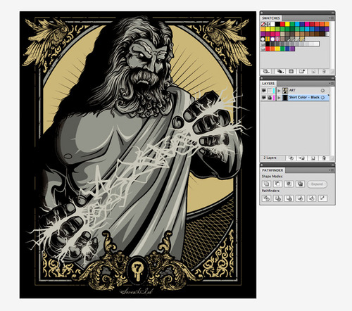
As you can see, I have the art on one layer and the shirt color on a separate layer. This is important because we want to keep the shirt color layer in the final file as a separate layer, so we’ll also keep this layer locked throughout the entire process. I also have three toolbars open: Swatches, Layers, and Pathfinder.
Let’s go through the separation process. The first thing you want to do is select all of your artwork (go to Select>All or hit Command+A) and create outlines out of your text. You can create outlines of your text by going to Type>Create Outlines or by hitting Command+Shift+O.
Now that your text is converted into outlines, we need to convert all of your strokes to outlines and expand your artwork into shapes. This is a two-part process. First, select all of your artwork and expand it’s appearance it by going to Object>Expand Appearance. Now, select all of your art again and go to Object>Expand. A box will pop-up, make sure you have Object, Fill, and Stroke checked and then hit the OK button.
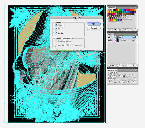
Your artwork is now fully expanded into shapes. Now we need to separate it all out into colors, so select all of it and Ungroup it a few times (Object>Ungroup or Command+Shift+G). I usually do this a few times, select all again, and do it again. The reason I do this is that sometimes things are grouped together more than you think, and if you have grouped items when we go to the next step you’ll have some trouble getting it work correctly.
Nothing visibly changes at this point, but now we’re going to see some magic happen. Select all of your artwork and then go to the Pathfinder tool and click on the Divide button, which is in the bottom left of the Pathfinder toolbar. What this does is flatten and separate all of your artwork by color, leaving you with tons and tons of fragmented shapes.
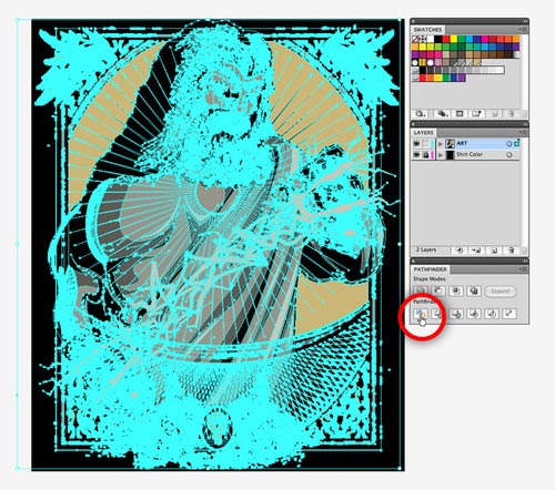
Once you’ve done this, you may have to ungroup everything one more time. Now we just have to combine the pieces of each color into one solid shape. Since this is a four color design, we will have four shapes in total when we’re finished. To combine the pieces, we need to select all of the pieces for the first color with the Magic Wand tool. You can modify the settings of this tool by double-clicking its icon in the main Tools toolbar, and we’ll be going for Fill Color since we’re dealing with shapes and not strokes. With the Magic Wand tool, click on the first color you’d like to combine and it will select all of the shapes containing that color.
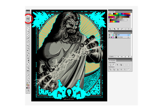
As you can see, I’ve chosen to select all of the gold colored pieces. Next, we simply combine all of them into one shape using the Unify tool in the Pathfinder. Hold Alt and then click the button to unify all of the pieces into one. The Expand button in the Pathfinder toolbar will become available once the tool is done working. Click the Expand button to finish the process and repeat for each other color.
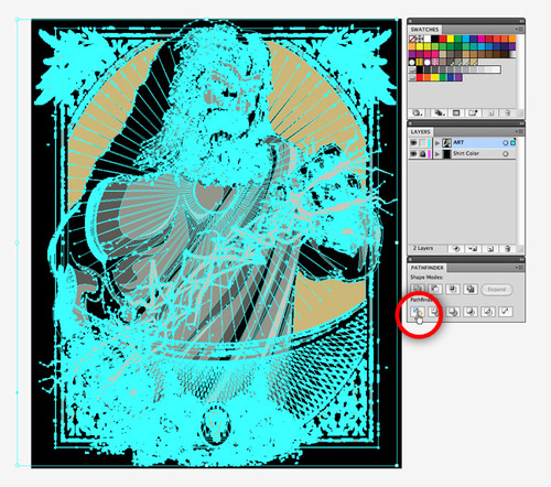
After each color is combined into a shape, create a layer for each and distribute each shape to a layer. I usually put the lightest color on the bottom and work up.
The last step is picking your PMS colors, these are universal color swatches that the printer will use to print your design. In the Swatches toolbar, click on the button near the top right as shown below and go down to Open Swatch Library>Color Books>PANTONE Solid Coated. This will pull up a Pantone Swatch window where you can choose the PMS colors to replace your current colors.
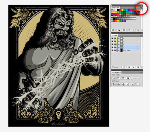
I highly recommend picking up a set of Pantone Color Bridge swatch books, they’re really the most accurate way for you to pick your colors. The color settings and brightness of your screen can influence the colors you see in the Swatches toolbar, which can then cause you to choose colors that you don’t want for your design. One swatch can vary greatly from another, so this is a critical step. What I do is try to match the colors I’ve used in my design on the screen with colors in my Pantone books. When I have them all selected, I try and line them up in the book so I can physically see if those colors go well together. Sometimes, I need to make adjustments and this process allows me to get the colors I want.
After choosing my colors from the swatch books, I use the Find feature in the Pantone Swatch window to select the proper colors. Click on that upper right hand button and then on “Show Find Field” to display this field. Before you click on each swatch, first select the art for the color you’re going to replace. Then, once you find the PMS color you can click on it and it will replace the current color. The PMS color can look very different on screen from what you see in the Pantone Color Bridge swatch books, which is why they’re important. The color in the book is what you’ll ultimately get. For example, after choosing my four Pantone colors and setting them for each layer, you can see a very noticeable difference in colors between what I had before and after.
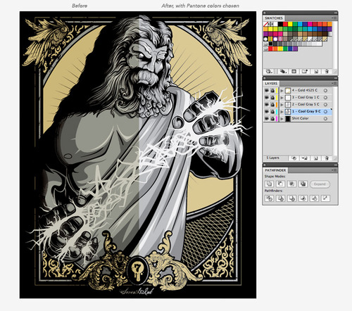
The colors I ended up with in the final print were closer to what I had chosen in the Pantone swatches, which is due to the fact that I changed my mind a bit as I was choosing the swatches. Because I used a book, I was able to better choose the proper colors for what I ultimately wanted the design to look like. Also, note that in the image above I have named each layer with the Pantone color that is used for that layer.
That’s it! Your file is now ready for print. Now we want to do a quick mockup for the printer to show sizing and placement on a shirt.
Section 2: Mockups
The mockup is a very easy step, but is no less important than file separation. Most designs are centered on the chest of the shirt, but you may want to have the art printed elsewhere. Regardless, doing the mockup gives the printer something to glance at so they know what you’re looking for.
There are tons of mockup templates out on the internet, you can find a ton just by doing a quick Google search. However, it’s always best to try and find a mockup template that utilizes the brand you will be printing on. I use American Apparel and am using a fairly standard mockup template that I found a while back. Here is a collection of free shirt templates that may come in handy during your mockup phase.
Here is the typical mockup that I provide to my printer. My shirts are tag-less and have a logo print on the sleeve, so I am sure to include these in the mockup and I also let the printer know the PMS colors for these print locations.

Easy, right? And with that, you can package up your files and send them to your printer—Real Thread, right?—so they can bring them to life.
Section 3: Quick Recap
Here is a quick recap of the steps we went over for the entire process:
1. Set your canvas to the correct size that you want, make sure the Color Mode is CMYK.
2. Create outlines and expand your artwork.
3. Ungroup, and then Divide it afterwards using the Pathfinder.
4. Use the Magic Wand to select the fragments of a color and then Unify them through the Pathfinder. Repeat for each color.
5. Distribute each color shape to a layer, choose a PMS color through the Swatches toolbar, and name each layer with the PMS color.
6. Create a mockup of your design on a shirt template.
And you’re done! It may take a little while the first time through, but once you get the hang of it the process will become faster each time. I hope this tutorial helps a few people out, I’ve been refining the process since day 1 and at this point I’m finding that this is the best and quickest way to make sure that my artistic vision is well-communicated to my printers.
Thanks for reading!


.svg)